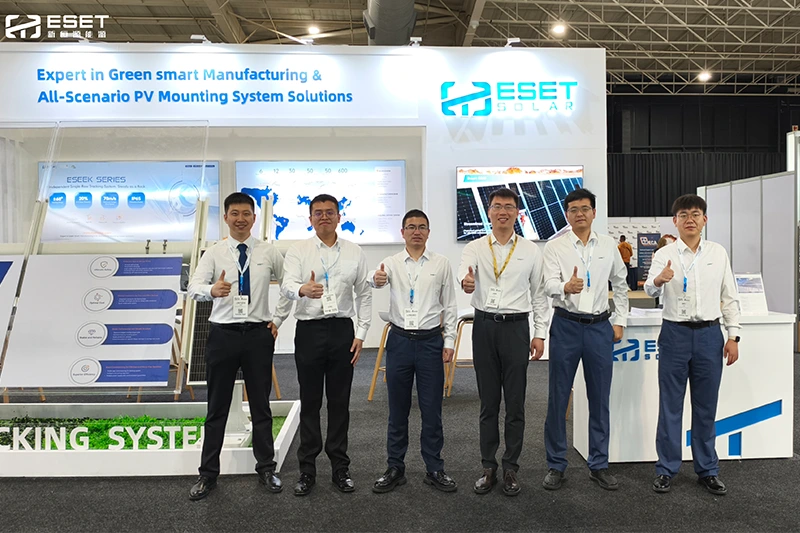
Under the strategic vision of “Smart + Network + Ecology + Global Layout,” ESET SOLAR has embarked on a comprehensive brand transformation, reaffirming its commitment to becoming the preferred expert in green smart manufacturing and all-scenario PV mounting solutions. The 2025 refresh introduces a disruptive new identity designed to reshape industry perceptions with intelligence and warmth.
The centerpiece of this evolution is a completely upgraded logo. While retaining the trusted logotype, a new bracket-style graphic symbol has been introduced. Inspired by structural frameworks intrinsic to the mounting industry, this symbol represents the company’s role in upholding the order of the energy world. At its core, a meticulously designed letter ‘T’ resembles a PV panel rotating towards the sun, symbolizing how technological innovation perpetually drives progress. The refreshed identity adopts a purer blue tone and a cleaner font structure for enhanced global recognition and memorability.
This rebranding challenges the conventional view of mounts as mere hardware. The open brackets evoke open arms, supporting the future of the PV industry and embodying a balance of strength and technological warmth. The new brand philosophy emphasizes greater inclusivity, growth, and possibility, aptly captured in the updated slogan: “Reliable Support, Sustainable Future.” ESET SOLAR is embarking on this new chapter with the courage to disrupt limits and a relentless spirit of exploration, dedicated to supporting a sustainable future for the global photovoltaic industry.


